Ultimate Suite for PowerBuilder
45 Controls and 12 Charts to modernize your PowerBuilder UI
Ultimate Suite for PowerBuilder is a set of controls created to help you modernize the user interface of your PowerBuilder applications. See below for a list and description of the controls contained within the suite.
- Animated Charts Featured
- Ribbon Menu Featured
- Animated Gauges Featured
- Excel-like Filter & Sort Featured
- Calendar Featured
- Windows 10 Message
- Docking System
- Tab Control
- Tile Menu
- Breadcrumb New
- Toolbar Strip
- Outlook Style Bar
- Toast Notifications
- Modal Window
- Window Selector New
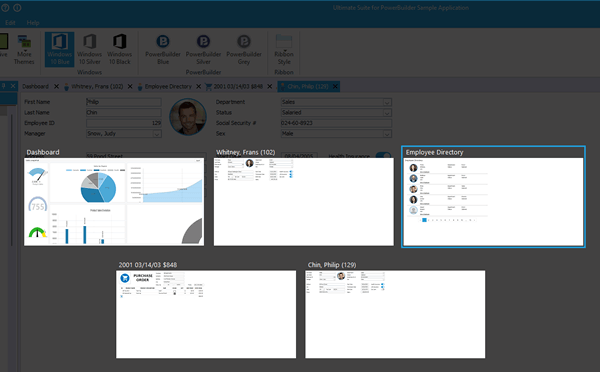
Add Animated Charts
Easily modernize your DataWindows
Create Rich & Animated Dashboards
Add a new presentation layer to existing DataWindows and Data Visualization features:
- Build rich dashboards
- Implement powerful drill down features
- Create modern PB reports

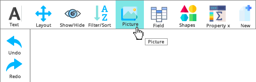
Convert your Menu into a Ribbon
Dynamically generate a Ribbon Menu from your PB Menu.
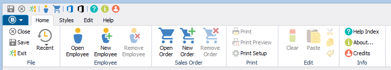
Keep maintaining your PB Menu, with all its business and security logic unchanged. With a few tweaks, dynamically generate a Ribbon Menu reflecting all its content.
- Group relevant functions into tabs.
- Organize menu items with large and small icons.
- Use a drop down menu.
- Add frequently used functions to a quick access toolbar.
- Expose more functionality to your users.
- And more...
Ultimate Suite for PowerBuilder 2020 introduces PowerMenu Pro:
A new window based off of PowerMenu. It includes a custom caption bar at the top and a Quick access toolbar in the caption bar.
Add Animated Gauges
Modern Gauges to animate your PB Application.
Ultimate Suite provides 4 styles of animated gauges that can be integrated into your dashboards and PB reports.
The Ultimate Suite Gauges controls come with a designer. You can modify any attribute of a gauge userobject and re-use them in your application without coding.

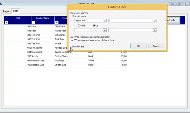
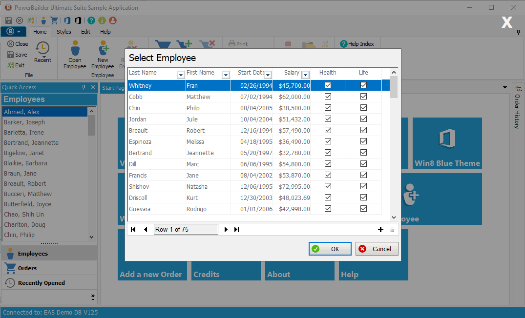
Excel-like Filter & Sort
Add filter & sort features to your DataWindows
With just 3 lines of code, implement a DW filtering control, that provides functionalities similar to Excel.
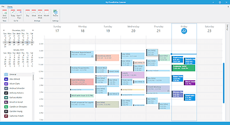
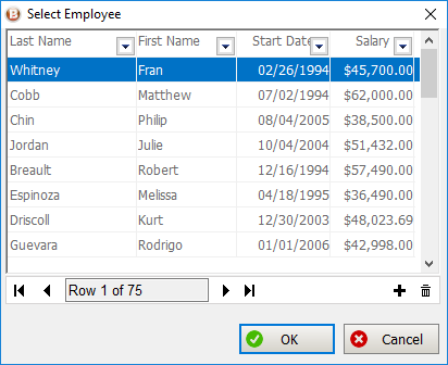
Calendar (PowerSchedule)
Add a powerful calendar to your PowerBuilder application.
PowerSchedule is a highly customizable and user-friendly Calendar control, offering features such as drag-and-drop, multiple views, extensive event options, seamless data binding and integration, custom user interfaces, and resource management capabilities.
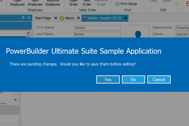
Modernize your Messages
Quickly apply a Windows 10-Style to all existing messages. Give them a modern look and feel.
Just prefix your messagebox() calls to leverage this new Control. For instance: gnv_message.MessageBox("Title", "My message.")
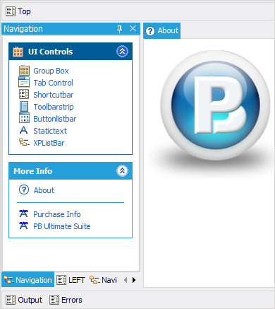
Docking System
The Docking System acts as a replacement to PowerBuilder's traditional MDI frame window. It gives users a tabbed interface to navigate between open windows. Additionally, it allows you to dock and pin commonly used functions to the top, bottom, left, or right sides of the window.
Tab Control
The Tab Control can be used as a direct replacement for the standard PowerBuilder tab control.
Using this control can give your application an immediate face-lift. There are many styles to choose from, more popularly, the VS2005 style.
Tile Menu
Ultimate Suite for PowerBuilder Tile Menu is a Windows tiles control that can be used for better navigation within your application. The design is responsive which means the layout will adjust to the size of the container that it's in (when resized by the container).
Breadcrumb
Enhance navigation in PowerBuilder apps with Breadcrumb
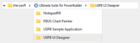
Help users navigate through your PowerBuilder application by indicating the location of the current page in a hierarchy and providing access to the next level up.
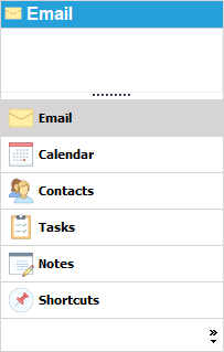
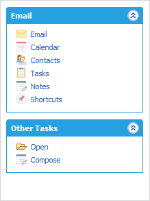
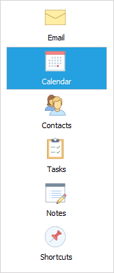
Outlook Style Bar
The Outlook Style Bar is meant to duplicate the look and behavior of the navigation control found in Outlook.
Toast Notifications
The PowerBuilder developers can choose from a variety of animations to incorporate Toast or Alert messages in their application.
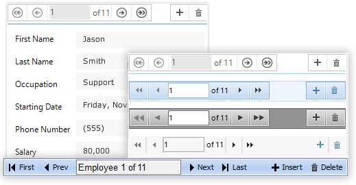
Window Selector (PowerWinSelector)
Streamline window selection in PowerBuilder apps
Display window thumbnails for quick activation, akin to Alt+Tab. Seamlessly switch between PowerBuilder application windows. Compatible with PowerDock and MDI windows.
Single Page Application
Single Page Applications display functionalities within a single window (or page).
Ultimate Suite for PowerBuilder contains 3 different windows objects to let you create Single Page PowerBuilder Applications:
- Single Page Application without Navigation (Basic)
- Single Page Application with Navigation
- Tabbed Caption
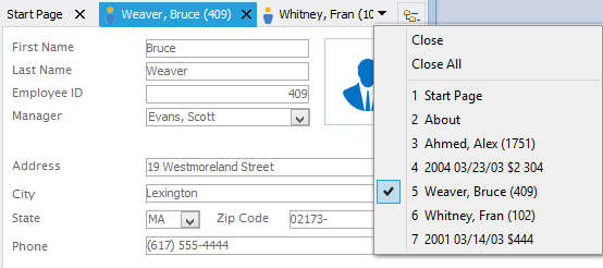
Tabbed Caption Window
The tabbed caption window behaves very similar to most modern web browsers.
Each opened window is displayed as a tab in the windows caption.
If needed, you can display a button to allow users to open new tabs.
Windows Style Bar
Windows Style Bar duplicates the look and behavior of the listbar commonly found in XP applications, such as the Control Panel.
Use this control to logically group application functions. Each group can contain links, labels, and lines.
Command Button
Ever wish you can give your buttons an icon and a bit more color?
With the Ultimate Suite for PowerBuilder CommandButton, you can.
This control offers 5 styles, and 5 themes. That's 25 different ways to display your buttons.
Taskbar Buttons (PowerTaskbarButton)
Upgrade the Windows Taskbar Button of your PB App
Deliver contextual notifications and allow users to perform actions from the Windows taskbar.


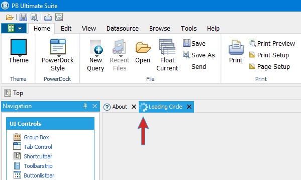
Loading Circles
The loading circle continuously rotates indicating that a process is waiting to complete. This control can be placed anywhere on screen.
Loading circle is also available in Docking controls, Tab Controls and Ribbon Menus (displays in the Docking control and Tab Control tabs or the Ribbon Menu status bar).
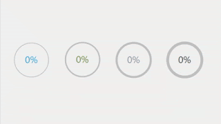
Circle Progress Bars
Create elegant previews that combine images and text in a responsive container. With this control, PB application designers can create a modular user interface that encourages users in an intuitive way to click to see more details.
StepBar
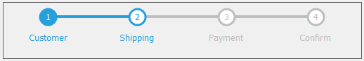
An intuitive UI control to track multi-step tasks, allowing customizable step counts, diverse color options, and support for both horizontal and vertical orientations.
Property Grid Control
Display a list of properties and values. Choose from many property types such as Image, Color, Lists, and Checkboxes.
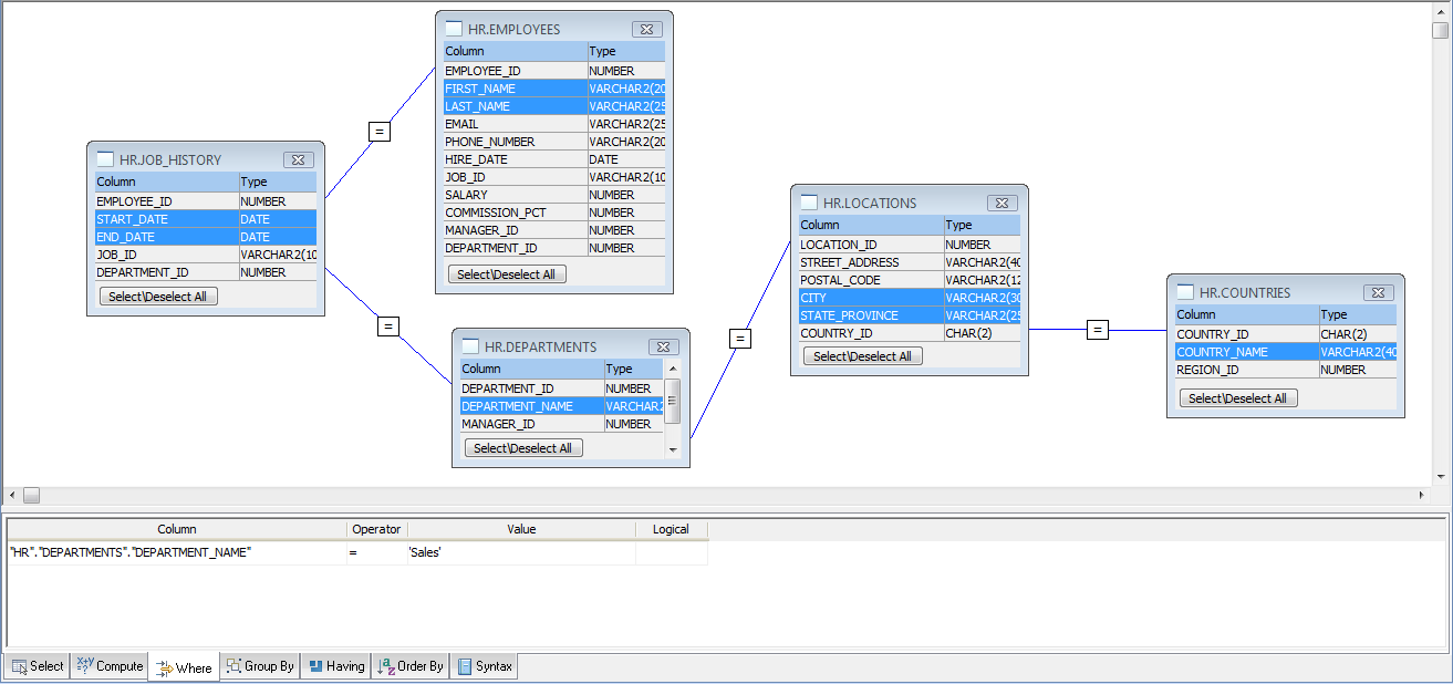
Query Builder
The Query builder control, similar to the one used in the graphic query designer for the DataWindow, offers native support for Oracle, SQL Server, SQL Anywhere and Sybase ASE. Generic ODBC connections are also supported. Other DBMS's can be added on a per request basis.
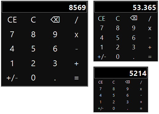
Calculator
A basic calculator control that users can use to calculate values for data entry. Depending on your needs, this independent control can be placed directly on your window, in a popup or a responsive window.
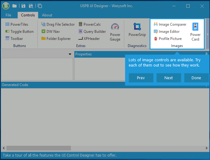
Product/Feature Tour
The Product/Feature Tour Control is used to guide users through the use of a PowerBuilder application or to introduce a new feature. It can also be used to flag important validation issues, customizing the look and feel of the action with predefined colors for each call.
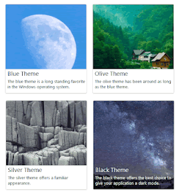
Profile Pictures
This control allows you to display a profile image in different sizes and styles (customizable color and outline shape). The images can come from binary database columns or physical files.

Rating Stars
This control allows you to integrate a star rating scale representing a ranking of any entity on a scale from 0 to X (where X can be any number you want). Users can use this control to rate and rank products or services belonging to the same group.

Cards
Create elegant previews that combine images and text in a responsive container. With this control, PB application designers can create a modular user interface that encourages users in an intuitive way to click to see more details.
Snipping Tool
PowerSnip allows taking screenshots of inside PowerBuilder applications. Users or testers can use it to report a problem to the development team.
Read more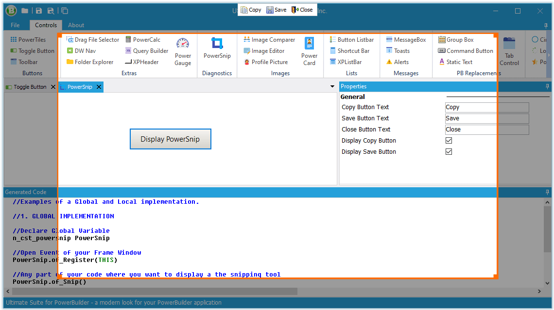
Image Editor
Embed an image editor in your PowerBuilder Application to modify it as per your media requirements.
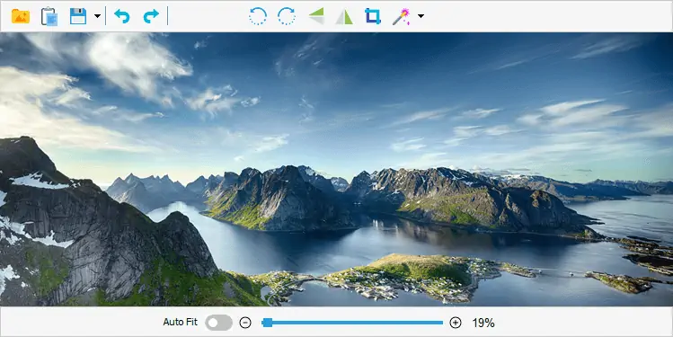
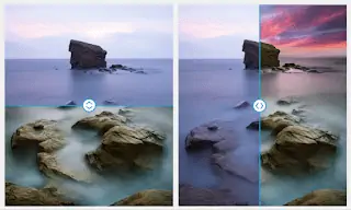
Image Comparer
This control minimizes the space required on user screens to compare two images with a horizontal or vertical slider revealing or hiding overlapping images.
Trackbar
New horizontal and vertical trackbar control.
A modern trackbar with fully customizable components, built from scratch for PowerBuilder applications. The PB developers can configure the color, shape or size of: the center line, the slider, tick marks, or the "tracked line".
Integrate the PowerTrackbar in your PB applications to add a feature for visually adjusting the numeric setting. For instance, allowing your users to adjust the brightness in an image editor.
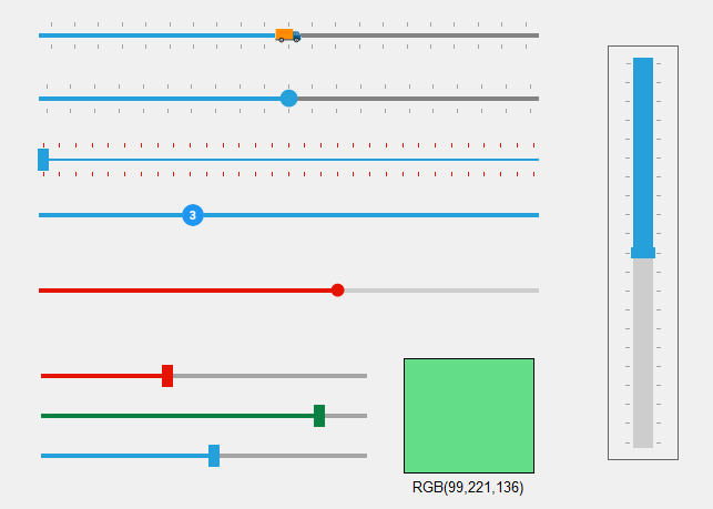
Rangebar
Horizontal and vertical range selector control.
The PowerRangebar is a distinct control that has all the features of PowerTrackbar, with a few extras.
With PowerRangebar, comes the additional functionality to select a range instead of a single value on a trackbar.
Your users can select a ‘start’ and ‘end’ value, and move the selection back and forth with the mouse.
Fuzzy SearchNew
Use the fuzzy algorithm to simplify search and allow users to easily find what they are looking for with no need to know the exact terms.
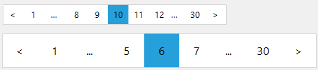
PaginationNew
Pagination control enables developers to provide a structured organization of content. This allows users to know where they stand when browsing large datasets.
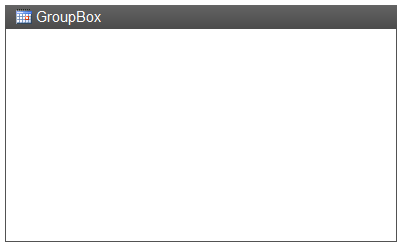
Groupbox
This Groupbox offers a few improvements over the standard PowerBuilder groupbox. You can add an image and display a gradient background.
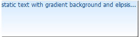
Custom Static Text
The static text control is used to display text on a window or userobject. It contains all the functionality of the standard PowerBuilder static text control but with a few extras.
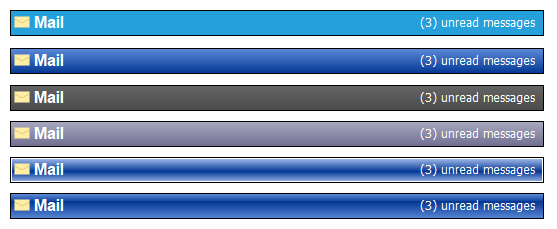
Gradient Header
The Gradient Header was developed to complement the Outlook 2003 Shortcutbar. It's the same type of control you see in Outlook 2003, letting you know which option was selected in the Shortcutbar.
Folder Explorer
The folder explorer control gives you the ability to add folder and file explorer functionality to your application.
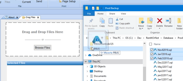
Drag and Drop Files
The Drag & Drop component can be added to any window or user object to allow users to drag files into the application.